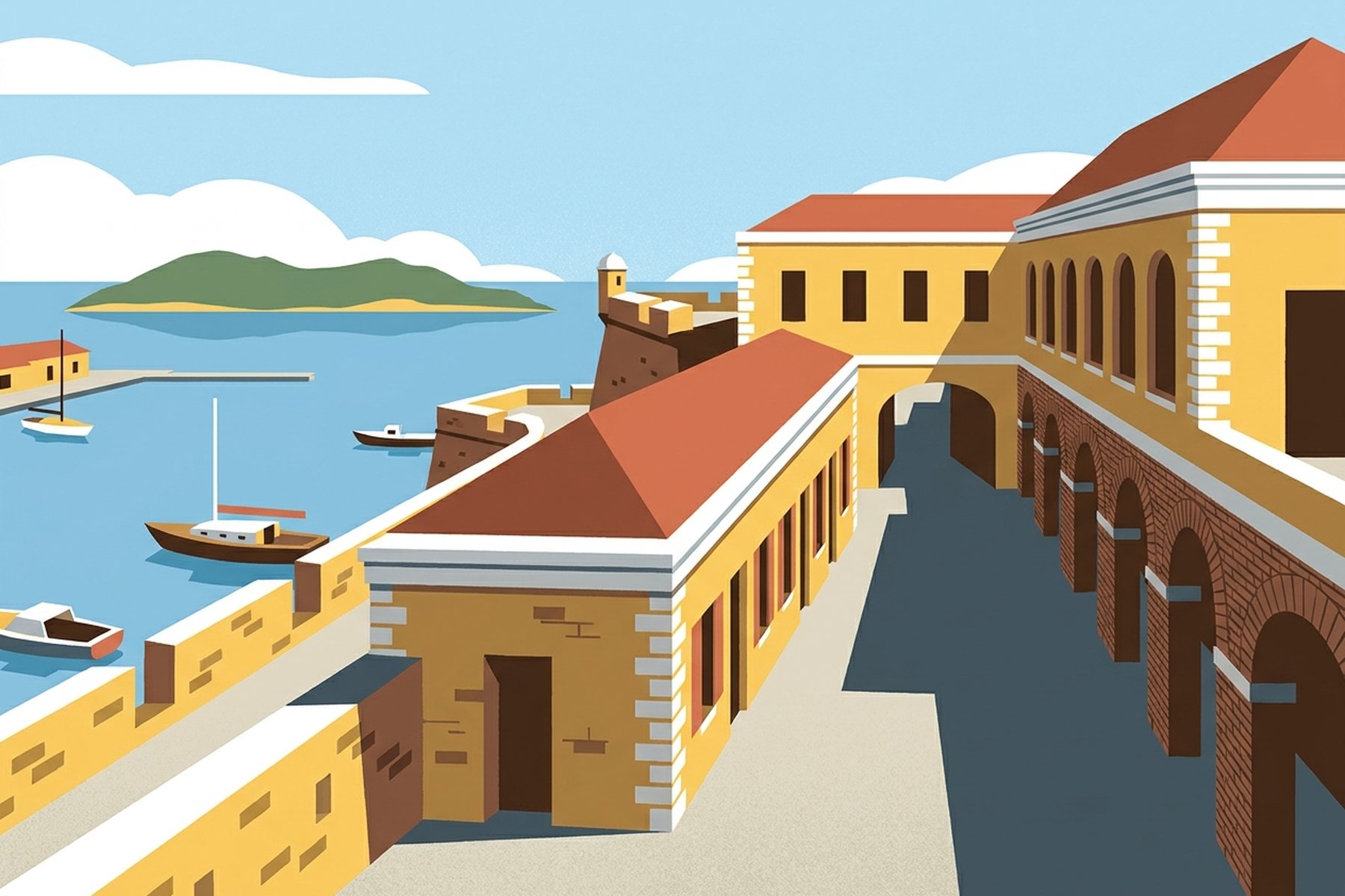
The Yellow Fort at Christiansted
Elio Marchetti mixes five colours to draw the Danish masonry and calm harbour water of St. Croix.
Cadmium yellow gouache, straight from the tube, sits beside an unmixed pot of raw umber on the blotter. That yellow is the coat on Fort Christiansvaern, the Danish-era fort that anchors the harbour in Christiansted. On paper, it threatens to dominate everything else. The masonry there is neither pale primrose nor mustard; it is a dense, chalky ochre-yellow that has baked under the Caribbean sun for centuries. When you work from photographs of St. Croix, your first impulse is to push that yellow toward postcard brightness. I knock it back immediately with chalk white and a dry scrape of umber, bringing it closer to the real lime wash on those thick walls.
Christiansted runs on a grid of arcaded streets beside a sheltered north-east harbour. In the drawing, the viewpoint sits slightly above the fort ramparts, looking out across the water towards Protestant Cay and the low line of the reef beyond. Our guide notes that the island spans roughly eighty-four square miles and twenty-two miles from tip to tip, yet its weight is concentrated along these working edges. In the morning light, around eight o’clock, the low sun cuts hard under the brick arches along the waterfront and leaves the western faces of the battlements in flat shadow. That shadow requires a cool slate grey mixed with a touch of cobalt, giving the stone bulk without turning muddy.
Five colours carry the entire plate. Along with the yellow ochre of the fort and that slate shadow, there is the chalk white of the parapet caps, a muted cerulean for the harbour shallows, and a warm terracotta for the roof tiles visible above the town arcades. For the low hills in the distance and Protestant Cay itself, I use a dry sap green grayed down with umber. East of here the land dries out into scrub and century plants, and I keep the foliage spare. I do not want plush jungle green on this side of the island. The wet hills with their tall mahogany and silk-cotton trees belong entirely to the far north-west, twenty miles off along Mahogany Road.
Drawing town architecture beside open water always tempts you into adding superfluous boat rigging and decorative cloud. I stripped all of that away. The licensed catamarans that run to Buck Island Reef National Monument sit at the wharf off-stage, beyond the right margin. What remains in the frame is the geometry of the fort itself: square embrasures, the rampart edge running diagonally across the lower third, and the flat plane of the sea behind it. The water inside the fringing reef is calm, so I paint it as a single wash of cerulean, graded pale where the shallows lap the seawall.
The picture conveys the stillness of early Danish masonry standing against trade-wind water. To ground the scene, I leave the red walls of Fort Frederik and the pier on the west coast for another assignment, keeping this study strictly to the north-east harbour. I finish the foreground flagstones with a stiff hog-bristle brush, dry-dragging raw umber across heavy watercolour paper. A square bottle of black drawing ink holds down the top left corner of the sheet while the wash dries.
From Vol. 2 · No. 10 · October 2026. This column draws on the magazine's guide to St. Croix. Details change; confirm specifics with the property before you travel.

The columns, every month.
One considered letter when a new issue lands: the cover story, the columns, the drawings and the month's news.